CSS加载动画
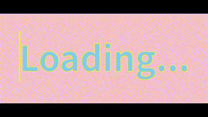
文本填充效果
效果图
代码实现
1 | <body> |
代码解析
data-text为自定义属性,属性值为Loading-webkit-text-stroke表示给文字描边::before为伪类选择器,表示在html结构前添加内容,content为添加的内容,attr表示把属性值作为内容,也可不写attr而直接写内容position: absolate使伪元素与html内容重合border-right为伪元素添加右边界,便于通过伪元素宽度的增减实现文本填充的效果
旋转变色
效果图
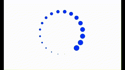
代码实现
1 | <body> |
代码解析
- 子绝父相,使每个子元素都重合在左上角,再通过自定义属性
--i使子元素旋转不同角度,通过::before添加内容为空的伪元素,形成20个圆组成的圆环 ani1中通过filter: hue-rotate()对色相进行旋转,使之呈现变色的效果ani2中通过scale缩放伪元素大小,在通过animation-delay对其进行延迟播放,当所有动画都开始播放时正好为动画的起始点,达成循环效果- 伪元素中若没有
transform: scale(0),则会从所有圆大小相同时开始执行
本博客所有文章除特别声明外,均采用 CC BY-NC-SA 4.0 许可协议。转载请注明来源 MNCLI!
 微信
微信
相关推荐
2025-06-08
盒子模型与Flex/Grid布局
盒子模型 盒子模型由四部分组成:Margin、Border、Padding、Content。 分为**标准盒模型(content-box)与替代盒模型(border-box)**。 标准盒模型 默认模式,box-sizing: content-box; width/height仅表示Content尺寸 实际宽度为width(height) + 2*(Padding + Border + Margin) 替代盒模型 通过box-sizing: border-box来设置 width/height包含Content、Padding、Border的尺寸 实际宽度为width(height) + 2*Margin 外边距塌陷 塌陷指当两个或多个垂直相邻的块级元素的外边距相遇时会合并成单个外边距的现象。 规则 两个正外边距时,实际外边距取大的边距,例:20px,50px 50px 一正一负外边距时,实际取两者之和,例:40px,-20px 20px 两个负外边距时,实际外边距取小的边距,例:-20px,-30px -30px 防止塌陷 使用BFC,添加display:...
2025-06-23
移动端HTML与CSS
<meta>标签1<meta name="viewport" content="width=device-width, user-scalable=no, initial-scale=1.0, maximum-scale=1.0, minimum-scale=1.0"> width=device-width,设置视口宽度为设备宽度 user-scalable=no,是否允许用户缩放 initial-scale=1.0, maximum-scale=1.0,...
评论